
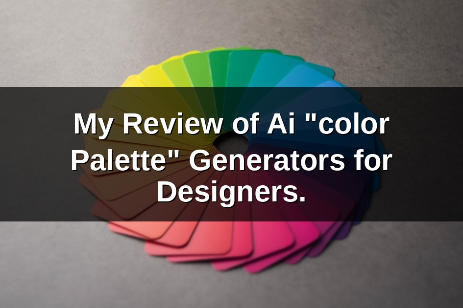
As designers, we often grapple with the elusive quest for the perfect color palette. It’s a dance between intuition, trend awareness, and a deep understanding of color theory fundamentals. For years, this process has been largely manual, driven by mood boards, inspiration hunting, and endless experimentation. Then came AI, promising to revolutionize everything from copywriting to image generation. Naturally, I was curious: could AI truly crack the code of color, offering a reliable “color palette” generator that genuinely assists designers? I decided to put several of these tools to the test, integrating them into my daily design challenges to see if they were a fleeting trend or a legitimate creative partner.
Unboxing the Algorithmic Rainbow: My First Dive into AI Color Tools
My initial foray into AI color palette generators felt like opening a box of digital crayons, but with a super-smart assistant guiding my hand. The promise was simple: input a keyword, an image, or even just a general mood, and out pops a harmonious color scheme. What struck me immediately was the sheer speed. Generating dozens of variations in seconds, something that would take a human designer hours of meticulous tweaking and cross-referencing, was genuinely impressive. Many tools offered various input methods, from descriptive text prompts like “vibrant summer beach” to uploading a hero image from which to extract a palette. This flexibility was a huge plus, allowing me to start from various points of inspiration.
I found myself experimenting with different approaches. Sometimes, I’d feed it a photograph I loved, eager to see how the AI interpreted its dominant and accent hues. Other times, I’d simply type in abstract concepts related to a project’s brand identity guide, like “modern minimalist tech” or “cozy rustic cafe.” The results were often surprisingly coherent, presenting hex codes, RGB values, and sometimes even CMYK, ready for immediate use. This initial phase was largely about discovery, understanding the different features, and gauging the immediate aesthetic appeal of the generated palettes. While some outputs felt generic, others offered genuinely fresh combinations I might not have considered on my own, sparking new creative directions.
Beyond Random Hues: Evaluating AI’s Understanding of Design Intent
The true test for any AI tool in a creative field is its ability to move beyond mere computation and grasp the nuanced “intent” behind a design brief. Can an algorithm truly understand the subtle difference between a palette suitable for a playful children’s book versus a sophisticated corporate website? My review focused heavily on this aspect. I found that while AI generators are excellent at identifying complementary colors, analogous schemes, or monochromatic variations based on mathematical principles, their “understanding” of emotional context or specific brand messaging was, predictably, limited.
For instance, prompting “luxury” might yield a palette heavy on gold, deep blues, and rich browns – a perfectly valid interpretation. However, it wouldn’t inherently know if that luxury was meant to be understated and minimalist or opulent and extravagant without further, more specific human guidance. This highlighted a crucial point: these tools are exceptional at *generating* options, but less so at *interpreting* complex creative briefs. They operate on patterns learned from vast datasets of existing designs, which means they can sometimes lean towards popular or even cliché combinations. The real value emerged when I used them as a brainstorming partner, generating a wide array of starting points that I could then filter and refine based on my explicit design intent and specific project needs.
Integrating AI-Generated Palettes into My Real-World Design Workflow
The rubber meets the road when a new tool finds its place in a designer’s actual workflow. For me, AI color palette generators quickly became invaluable at the *ideation* and *exploration* stages. Faced with a blank canvas or a looming creative block, these tools provided an instant injection of inspiration. Instead of spending an hour manually pulling colors from images or endlessly tweaking sliders, I could generate 10-20 distinct palettes in minutes, giving me a solid foundation to critique and build upon.
I found them particularly useful for projects requiring a rapid turnaround or when working on multiple iterations for a client. For UI/UX design principles, I’d often generate palettes and then quickly apply them to wireframes or mockups to test different visual moods and ensure accessibility. Many tools even offer features to check contrast ratios, which is a huge benefit for ensuring compliance with WCAG accessibility guidelines. For branding projects, I’d use them to explore secondary or tertiary color options that complement a primary brand color, ensuring a cohesive yet versatile visual language. They became a powerful accelerator, reducing the initial legwork and allowing me to dedicate more time to the strategic and conceptual aspects of design.
The Human Element’s Enduring Role: Fine-Tuning AI’s Color Suggestions
Despite their impressive capabilities, my review reinforced the irreplaceable value of the human designer. AI color generators are fantastic assistants, but they are not replacements for nuanced decision-making. Almost every palette generated required some degree of human refinement. This often involved adjusting saturation, tweaking a hue slightly, or swapping out one color for another that better aligned with the project’s specific emotional resonance or client brief. For example, an AI might generate a beautiful palette, but one of the colors might clash with an existing brand asset or fail a specific accessibility test for text legibility. This is where my expertise, my understanding of color psychology, and my client’s specific needs came into play.
The best way to utilize these tools, I discovered, is not to blindly accept their output but to treat them as a starting point. They provide a scaffold, a well-structured framework upon which to build. My role evolved from being the sole architect of color to becoming a skilled editor and curator. I’d leverage their speed for breadth of exploration, then apply my human judgment for depth and precision. This symbiotic relationship meant I was more efficient without sacrificing the artistic integrity or strategic intent of my designs.
Weighing the Creative Gains: Is AI Truly a Designer’s Ally or Just a Gimmick?
After a thorough review, my verdict is clear: AI color palette generators are far from a gimmick; they are a legitimate, valuable ally for designers. They excel at tackling the initial, often time-consuming task of color exploration, offering a vast array of harmonious options almost instantaneously. This frees up precious mental bandwidth, allowing designers to focus on higher-level strategic thinking, client communication, and the intricate details that only a human eye can truly perfect. They can be a powerful tool to overcome creative block, offering fresh perspectives when inspiration wanes.
However, it’s crucial to approach them with the right mindset. They are tools for augmentation, not automation. They don’t possess the intuition, the cultural understanding, or the emotional intelligence that defines truly exceptional design. A designer’s expertise in principles of good design and color psychology research remains paramount.